Prométhéa
A flexible brand

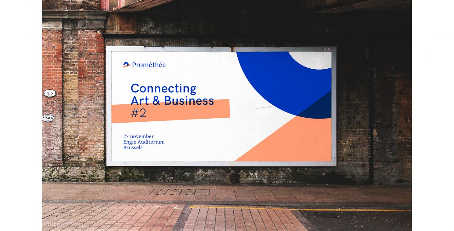
Inspire, learn and connect
Prométhéa creates links and sets up encounters between the cultural, heritage and business worlds in a dedicated, professional and – above all – human manner. Prométhéa has become a highly renowned sponsorship organisation in Belgium through its capacity for building bridges between people, companies, institutions and associations. In addition to the above, the organisation also provides guidance to companies in the development of their sponsorship strategy, based on the understanding that corporate social responsibility requires insight.
The Prométhéa brand reconsidered
As a future-driven organisation, Prométhéa has evolved strongly in recent years. We therefore reconsidered the DNA of the organisation, in which the first step was to create a stronger positioning. The brand concept could be sharper, but also simpler.
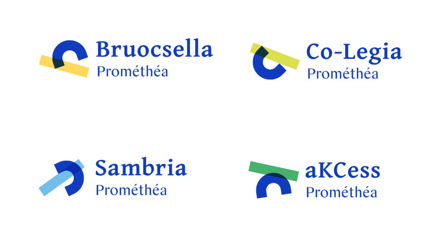
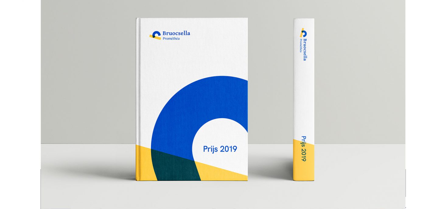
Prométhéa serves as the driving force in terms of organisation, in addition to which the regional collectives are jointly involved in the decision-making process. Each of these collectives has its own style of communication and identity. As a result, there was a need to give all parties sufficient autonomy while concurrently striving for consistency. In terms of strategy retaining their current names was a logical choice, albeit under the umbrella of Prométhéa.
Stepwise
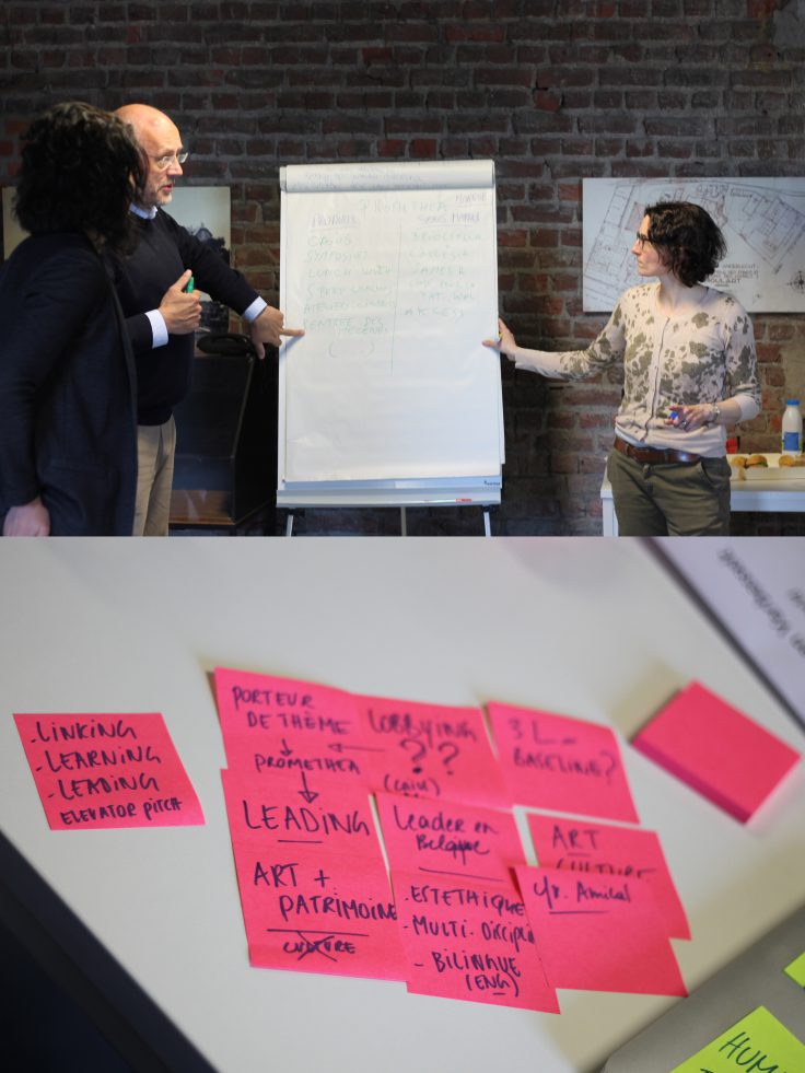
A change process takes time and requires a lot of energy from an organisation. Together with Prométhéa we plotted a stepwise course and gave stakeholders and decision-makers a role in this. This gave everyone involved a clearer picture of the process. During the preliminary phase, ample opportunities were created for broad input and an open dialogue. This creates trust and makes it possible for everyone involved to not only look at their future but also at their present situation. The human element in such a process is almost as important as the strategic.

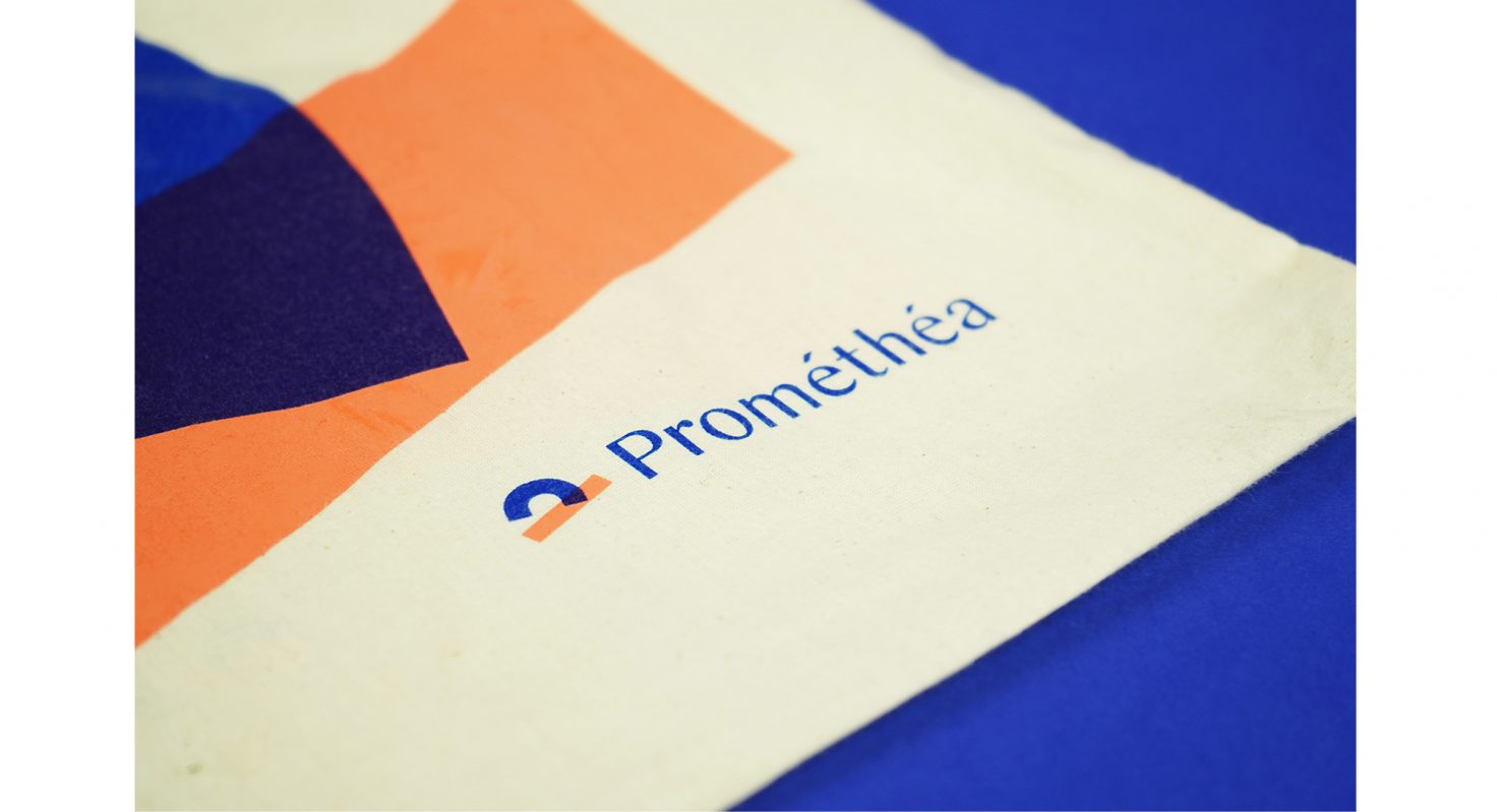
Simple, playful and professional
The challenge: to determine a suitable form for the brand that can be deployed in a wide range of applications and allows it to be shaped into many variants. The strength in this lies in the simplicity and combination of forms, thus enhancing the agility of the logo as an image.
A connecting foundation colour interspersed with different support colours ensures better consistency. A great deal of attention is paid to readability and typography in all communication issued by Prométhéa. This approach is reflected in our choice of font. The result: a blend of two styles in which the letters are given a prominent place.


The impact?
Our aim is to put Prométhéa’s role as a connecting network organisation even more prominently in the spotlight through stronger visual positioning. Enhancing the flexibility of the various style elements, the necessary framework and the requisite tools will spur the regional collectives to embrace and propagate the brand’s new identity